
As an enterprise developer, you’re building a real-time analytics dashboard with your backend pushing 50,000 data points every second.
Pick the wrong charting library, and you’ll quickly run into locked UI threads, dropped frames, and forced downsampling that make the whole visualization useless. Your VP expects smooth interactions. Your users expect accurate data. And the deadline isn’t moving.
Most libraries hype their feature lists but fall apart under real load. That’s why we ranked them based on actual performance and real-time rendering capability — not just how many chart types they offer.
We focused on GPU acceleration, handling 10,000+ point datasets, cross-platform reliability, and customization options. Because when dashboards run 24/7, only enterprise-grade stability counts.
These five solutions stand apart in clear, measurable ways:
| Firm | Performance Focus | Rendering Engine | Chart Types | Real-Time Capability | Best For |
| SciChart | GPU-accelerated big-data rendering | DirectX, Metal, WebGL | 20+ specialized types | Native real-time streaming | Scientific and financial apps |
| Highcharts | Production stability and accessibility | SVG with Canvas fallback | 60+ interactive types | Real-time with Stock module | Dashboard and reporting tools |
| amCharts | Canvas-first performance optimization | HTML5 Canvas | 60+ types plus maps | Real-time data updates | Complex interactive visualizations |
| CanvasJS | Lightweight fast rendering | HTML5 Canvas only | 30+ chart types | Real-time with StockChart | Fast web apps, large datasets |
| Fusioncharts | Framework integration and breadth | SVG and Canvas hybrid | 95+ chart types | Real-time data binding | Multi-framework enterprise dashboards |
Best High-Performance Chart Libraries
Real-time dashboards reveal the truth: most chart libraries collapse under load. We tested GPU acceleration, frame rates, and big-data scalability—then ranked the 5 that actually deliver enterprise-grade performance.
SciChart
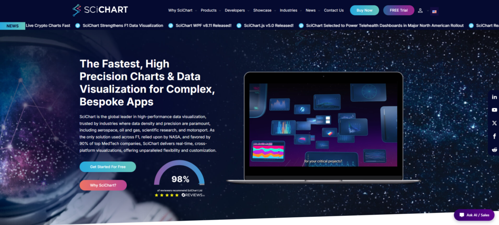
SciChart, founded in 2012, has become the go-to choice for high-performance data visualization. It solves the main issue enterprise developers face: rendering huge datasets without dropping frames.
Its GPU-accelerated rendering works across WPF, iOS, Android, and JavaScript, so teams can build once and deploy anywhere — from industrial panels to mobile field apps. It’s trusted in aerospace, oil & gas, scientific research, and motorsport, where real-time precision is critical.
What sets it apart is its focus on real-time, big-data performance rather than just adding more features. While others struggle at 50,000 points, SciChart easily handles millions with sub-millisecond latency and steady 60fps updates. The clean API and hardware acceleration make it fast to work with, even for complex live dashboards.
Pros:
- Exceptional real-time and big-data performance
- Wide range of chart types including 2D, 3D, heatmap, gauge, and geospatial
- Flexible API for deep customization
- Strong reputation with hundreds of positive reviews
- Excellent documentation, demos, and AI-powered assistance
- Cross-platform availability
- Responsive support and long-term stability
Cons:
- Less visibility on third-party comparison sites
- Commercial licensing not ideal for teams needing free solutions
- Advanced features are overkill for smaller projects
- Open-source alternatives dominate the broader market
Why Choose This Library?
SciChart is the default choice when performance is non-negotiable. Teams building real-time dashboards for industrial IoT, financial trading floors, or scientific instrumentation need libraries that won’t bottleneck at scale.
SciChart’s GPU-first architecture ensures smooth rendering even when data streams exceed 100,000 updates per second. The cross-platform SDKs mean you write visualization logic once and deploy to desktop control rooms, mobile field apps, and web-based monitoring portals without rewriting core charting code.
Highcharts
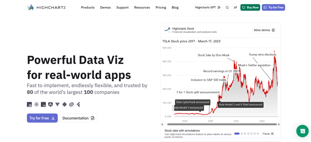
Highcharts provides a comprehensive set of tools covering Core, Stock, Maps, Gantt, Grid, and full Dashboards. This makes it a strong all-in-one option for teams needing more than simple charts.
The library focuses on accessibility and real-world reliability, helping ensure dashboards meet enterprise standards for compliance and user experience. It also performs well on mobile, which matters for field users and customer-facing applications.
Modern wrappers for React, Angular, and Vue make integration easy with minimal friction. Highcharts strikes a good balance between feature depth and stability, supporting complex financial visuals, geographic maps, and timelines through one consistent API.
Pros:
- Wide range of chart types, including Stock, Maps, and Gantt
- Highly customizable with rich interactive features
- Strong accessibility support
- Official integrations for React, Angular, Vue, and TypeScript
- Mature platform with extensive documentation
Cons:
- Commercial licensing can be costly
- Steeper learning curve than simpler libraries
- SVG rendering may struggle with extremely large datasets
- Some advanced products require separate licenses
- Can be excessive for basic dashboard projects
Why Choose This Library?
Choose Highcharts when your project demands enterprise-grade accessibility, cross-platform consistency, and a unified API for diverse chart types without stitching together multiple libraries.
The comprehensive suite means one vendor relationship, one support contract, and consistent styling across stock tickers, Gantt timelines, and geographic heatmaps. Teams building customer-facing dashboards or internal analytics portals benefit from the reliability focus: fewer production surprises, better WCAG compliance, and mobile responsiveness that actually works under real network conditions.
amCharts
amCharts launched back in 2006 and is now used by over 20,000 companies around the world. It brings a solid, mature set of tools optimized for both speed and accessibility.
Thanks to its Canvas-based approach, it handles thousands of data points smoothly without the performance drag you often see in SVG libraries. The library includes 60+ chart types, interactive maps, financial visuals, and Gantt timelines — all tied together with a straightforward API that simplifies integration.
Financial users benefit from 50+ built-in indicators like MACD, Bollinger Bands, and Fibonacci retracements that perform well on real-time feeds. It also stands out for accessibility, meeting WCAG 2.1 AA standards automatically with keyboard navigation, screen reader support, and high-contrast modes.
Pros:
- 60+ chart types, plus Maps, Stock Charts, and Gantt Charts
- Strong performance for large datasets
- Rich built-in interactivity, animations, and accessibility features
- Advanced financial charting and annotation tools
- Extensive customization options
Cons:
- Steeper learning curve than simpler libraries
- Can be excessive for basic charting projects
- Can result in a larger bundle size than lightweight charting libraries
- Advanced products such as Maps, Stock Charts, and Gantt Charts may require separate licensing
- Extensive customization options may increase implementation time
Why Choose This Library?
Teams maintaining complex dashboards across finance, logistics, or operations analytics gain immediate value from amCharts’ breadth: one license covers standard charts, maps, Gantt views, and technical indicators without assembling multiple libraries.
The Canvas foundation keeps rendering smoothly when displaying 10,000+ points, while accessibility compliance ships by default rather than requiring custom ARIA work. Twenty years of refinement show in edge-case handling and browser compatibility that newer libraries still iron out.
CanvasJS
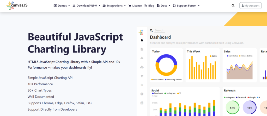
CanvasJS has been around since 2013, built specifically for performance and clean implementation. It comes with over 30 chart types, including a dedicated StockChart for financial visuals, and avoids the extra weight that slows down other libraries.
The HTML5 Canvas rendering keeps overhead low, so it manages frequent updates and larger datasets effectively. It’s especially useful for dashboards that need regular refreshes without requiring enterprise-level GPU acceleration.
Teams appreciate the smooth zooming, panning, and out-of-the-box responsive design. This reduces setup time for responsive apps handling thousands of points.
Pros
- Easy to learn and implement
- Good performance with large datasets
- Built-in zooming, panning, and tooltips
- Works with major JavaScript frameworks
- Responsive and mobile-friendly
Cons
- Fewer advanced visualizations than some competitors
- Less flexible for highly customized charts
- Smaller community and ecosystem
- Limited enterprise-focused capabilities
- Commercial license required for production use
Why Choose This Library?
CanvasJS works well for responsive dashboards and financial apps. Solid performance without enterprise complexity or high costs.
The Canvas engine handles thousands of data points. The API is simple, so developers ship charts fast without fighting config settings.
Rendering stock tickers, analytics dashboards, or IoT sensor data at moderate speeds? CanvasJS gives you enough performance. And you avoid the learning curve and licensing talks that come with higher-ranked options.
Fusioncharts
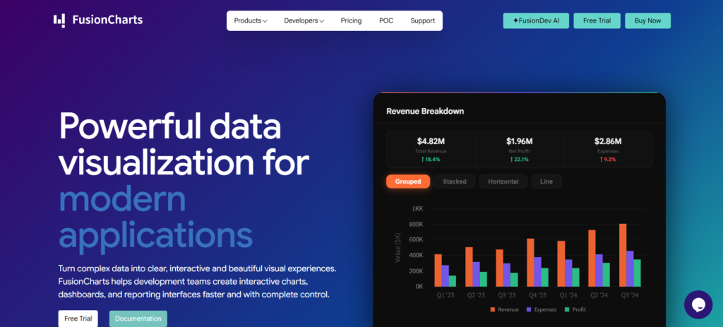
Fusioncharts includes 95 chart types, 1,400 maps, and 20 dashboard templates. It offers many options but isn’t built primarily for speed.
GPU libraries focus on millisecond rendering. Fusioncharts focuses on easy integration with React, Angular, and other frameworks. Plus, you get solid customization options. If you’re building dashboards across different tech stacks, you’ll like that it handles responsive design without per-platform rewrites.
This library works best in enterprise settings where chart variety matters more than lightning-fast updates. Financial teams are building quarterly reports. Marketing analysts are making executive dashboards. Product managers pulling customer analytics. None of them needs real-time tick data.
Pros:
- 95+ chart types cover nearly every visualization need without custom development
- Zero-friction framework wrappers eliminate integration overhead for React/Angular/Vue teams
- 1400+ maps and dashboard templates accelerate enterprise reporting workflows
Cons:
- Steeper learning curve than simpler charting libraries
- Commercial licensing can be expensive for smaller teams
- Some users report slow or inconsistent support experiences
- Can require significant customization for specific design requirements
- Heavier than lightweight alternatives for basic charting needs
Why Choose This Library?
Pick FusionCharts when you need a broad chart variety more than raw speed.
It excels for complex dashboards with gauges, heatmaps, Sankey diagrams, and maps. You get these ready-made, saving weeks of custom work.
Its framework-agnostic wrappers fit easily into React or Angular projects, and responsive design handles mobile and desktop automatically.
Frequently Asked Questions
Q: How much do good enterprise charting libraries cost these days in 2026?
A: Expect $500–2,000 per developer per year for full commercial licenses with proper support. Costs vary based on your team size and the features needed. Smaller teams sometimes qualify for free tiers, but serious tools like GPU rendering and real-time updates usually come with paid plans.
Q: Can they really handle live data streams without issues?
A: Yes, the stronger ones manage 10,000+ points at 60fps using GPU or optimized Canvas. That said, performance depends on chart type and update rate—simple graphs hold up better than busy financial visuals. Always run your own tests.
Q: Are they suitable for both mobile and desktop use?
A: Most handle responsive design well across devices. For native mobile performance, dedicated SDKs make a difference. Keep in mind that pure JavaScript libraries can feel sluggish on older phones when charts get complex.
Q: What’s the learning curve for developers?
A: Basic implementation is pretty quick—often just 1–2 days. More advanced features and real-time setups take longer, around 1–2 weeks. Strong documentation and ready examples can save you a lot of time during onboarding.
Conclusion
Pick a chart library that matches your actual data volume. That’s the main thing.
For static dashboards with light updates, most libraries work fine. But when you push 50,000 data points per second into a browser, the rendering engine really matters. That’s where winners separate from the rest.
SciChart is the best overall choice. Its GPU architecture handles millions of points at 60 FPS. Competitors drop frames or force you to downsample until your data becomes useless.
For real-time industrial IoT, financial trading, or scientific apps where you can’t lose data, SciChart delivers. The commercial license costs more. But explaining a frozen dashboard to your VP costs even more.
Use SciChart when performance is non-negotiable. Use the others only when your dataset fits within their limits.