
This is an adapted transcript of a talk I gave at Promcon 2018. You can find slides with additional information on our Prometheus deployment and presenter notes here. There's also a video.
Tip: you can click on the image to see the original large version.
Here at Cloudflare we use Prometheus to collect operational metrics. We run it on hundreds of servers and ingest millions of metrics per second to get insight into our network and provide the best possible service to our customers.
Prometheus metric format is popular enough, it's now being standardized as OpenMetrics under Cloud Native Computing Foundation. It's exciting to see convergence in long fragmented metrics landscape.
In this blog post we'll talk about how we measure low level metrics and share a tool that can help you to get similar understanding of your systems.
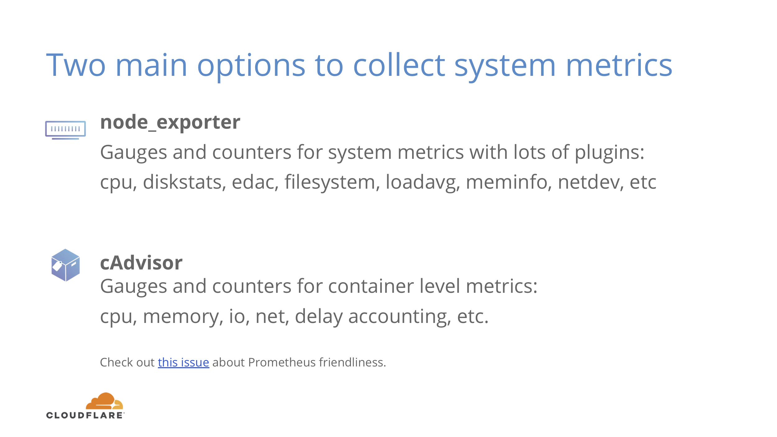
There are two main exporters one can use to get some insight into a Linux system performance.
The first one is node_exporter that gives you information about basics like CPU usage breakdown by type, memory usage, disk IO stats, filesystem and network usage.
The second one is cAdvisor, that gives similar metrics, but drills down to a container level. Instead of seeing total CPU usage you can see which containers (and systemd units are also containers for cAdvisor) use how much of global resources.
This is the absolute minimum of what you should know about your systems. If you don’t have these two, you should start there.
Let’s look at the graphs you can get out of this.
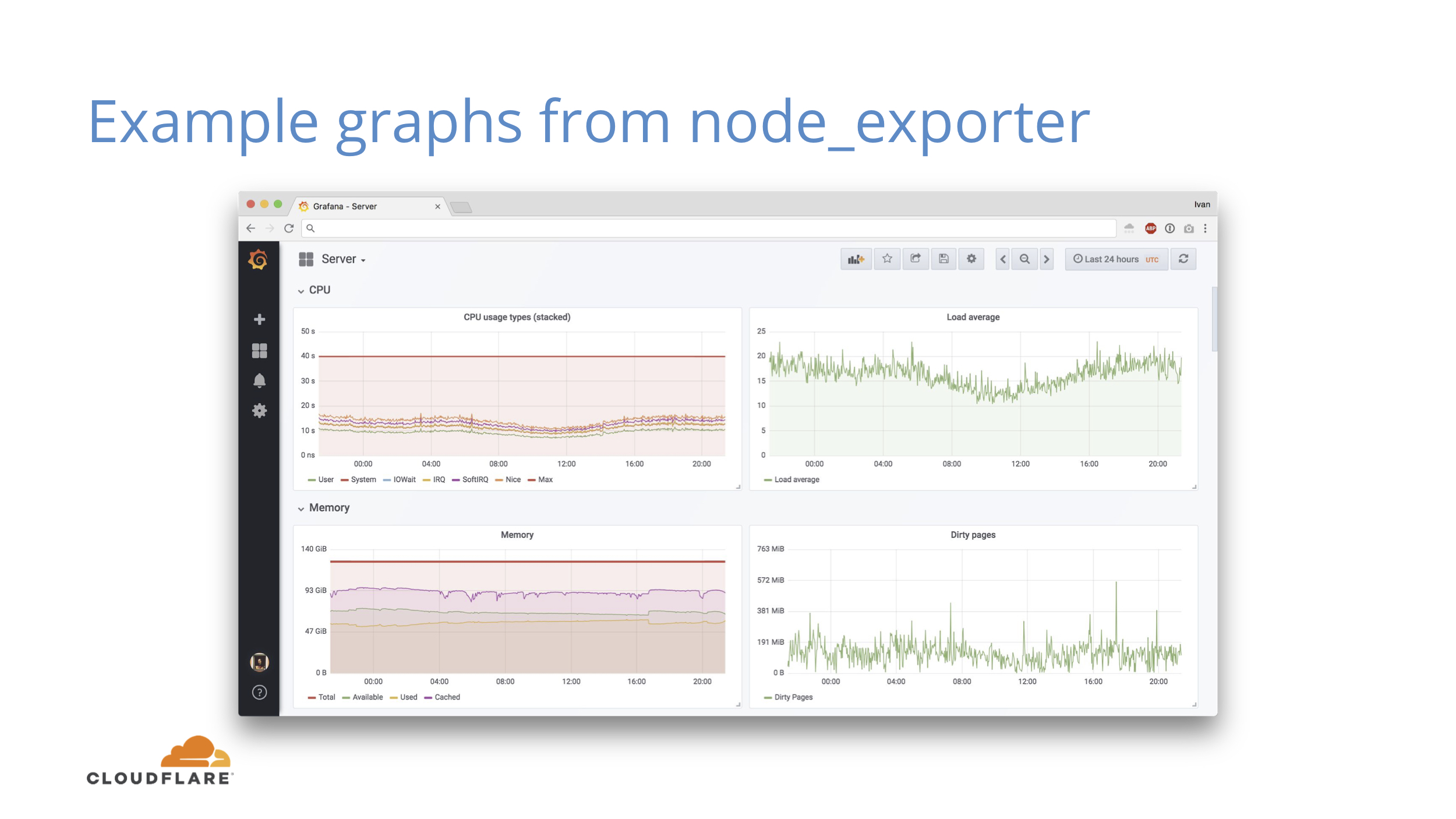
I should mention that every screenshot in this post is from a real production machine doing something useful. We have different generations of hardware, so don’t try to draw any conclusions.
Here you can see the basics you get from node_exporter for CPU and memory. You can see the utilization and how much slack resources you have.
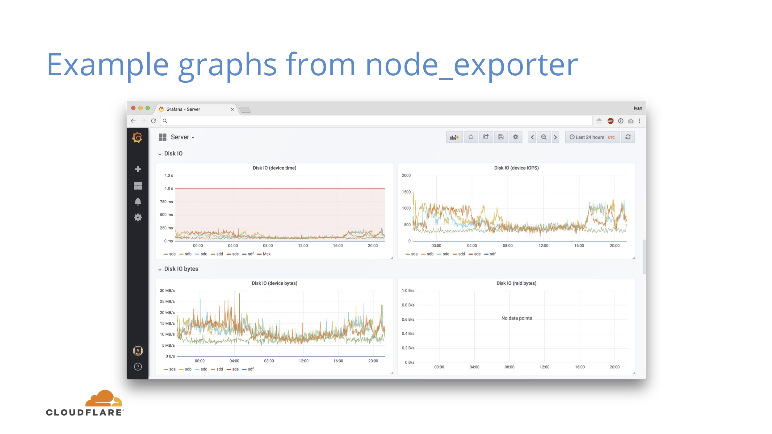
Some more metrics from node_exporter, this time for disk IO. There are similar panels for network as well.
At the basic level you can do some correlation to explain why CPU went up if you see higher network and disk activity.
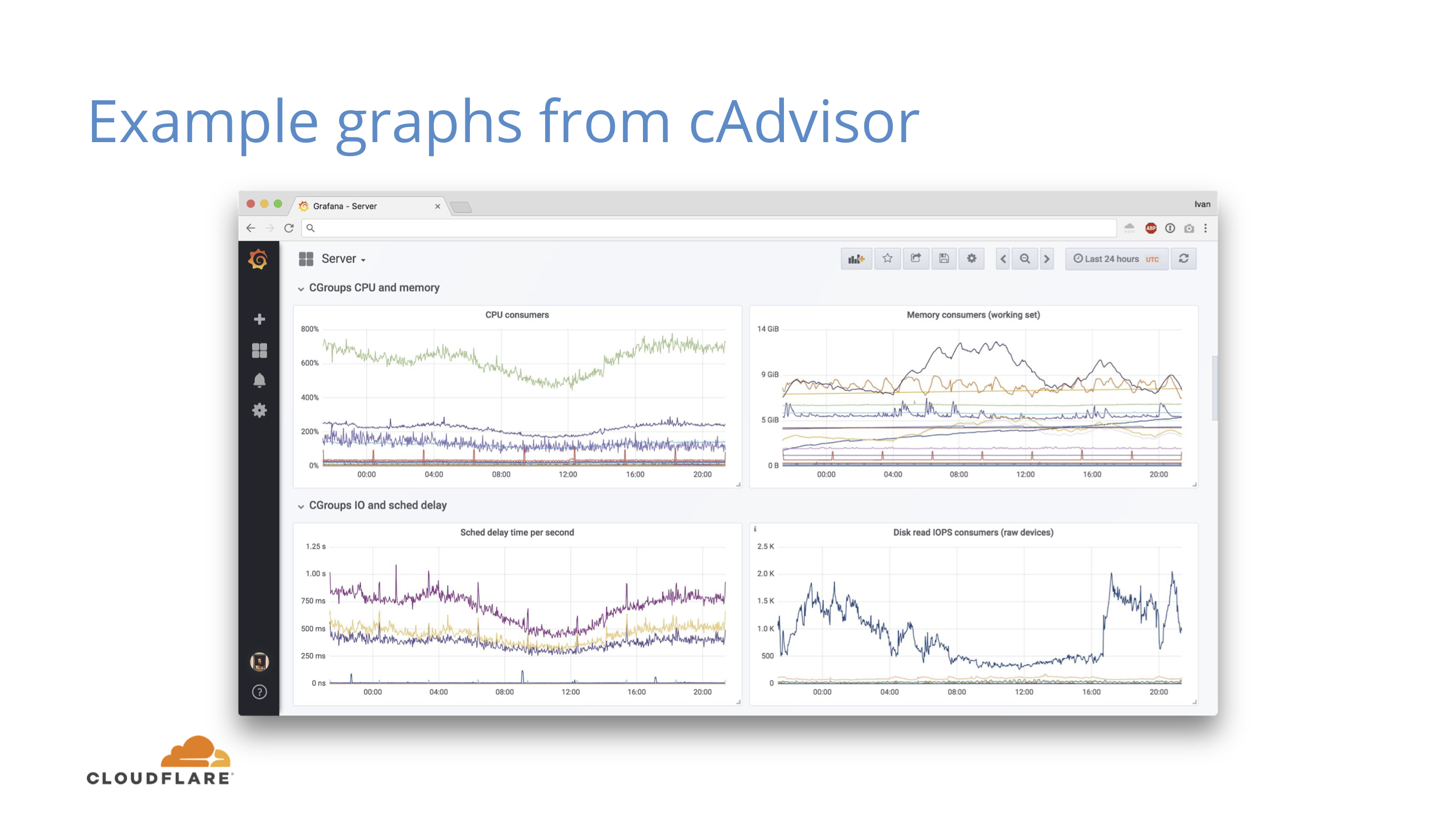
With cAdvisor this gets more interesting, since you can now see how global resources like CPU are sliced between services. If CPU or memory usage grows, you can pinpoint exact service that is responsible and you can also see how it affects other services.
If global CPU numbers do not change much, you can still see shifts between services.
All of this information comes from the simplest counters and first derivatives (rates) on them.
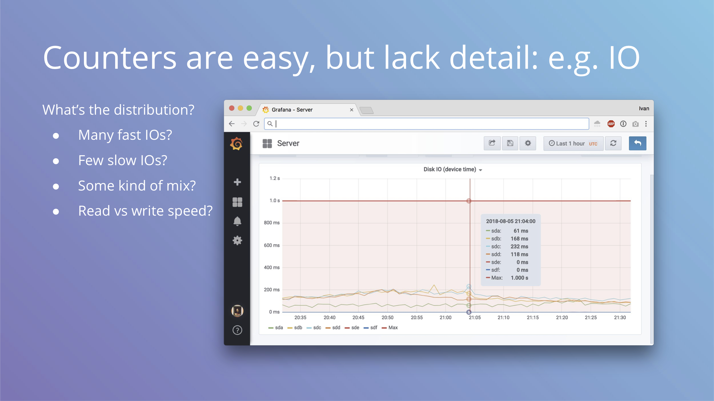
Counters are great, but they lack detail about individual events. Let’s take disk io for example. We get device io time from node_exporter and the derivative of that cannot go beyond one second per one second of real time, which means we can draw a bold red line at 1s and see what kind of utilization we get from our disks.
We get one number that characterizes out workload, but that’s simply not enough to understand it. Are we doing many fast IO operations? Are we doing few slow ones? What kind of mix of slow vs fast do we get? How are writes and reads different?
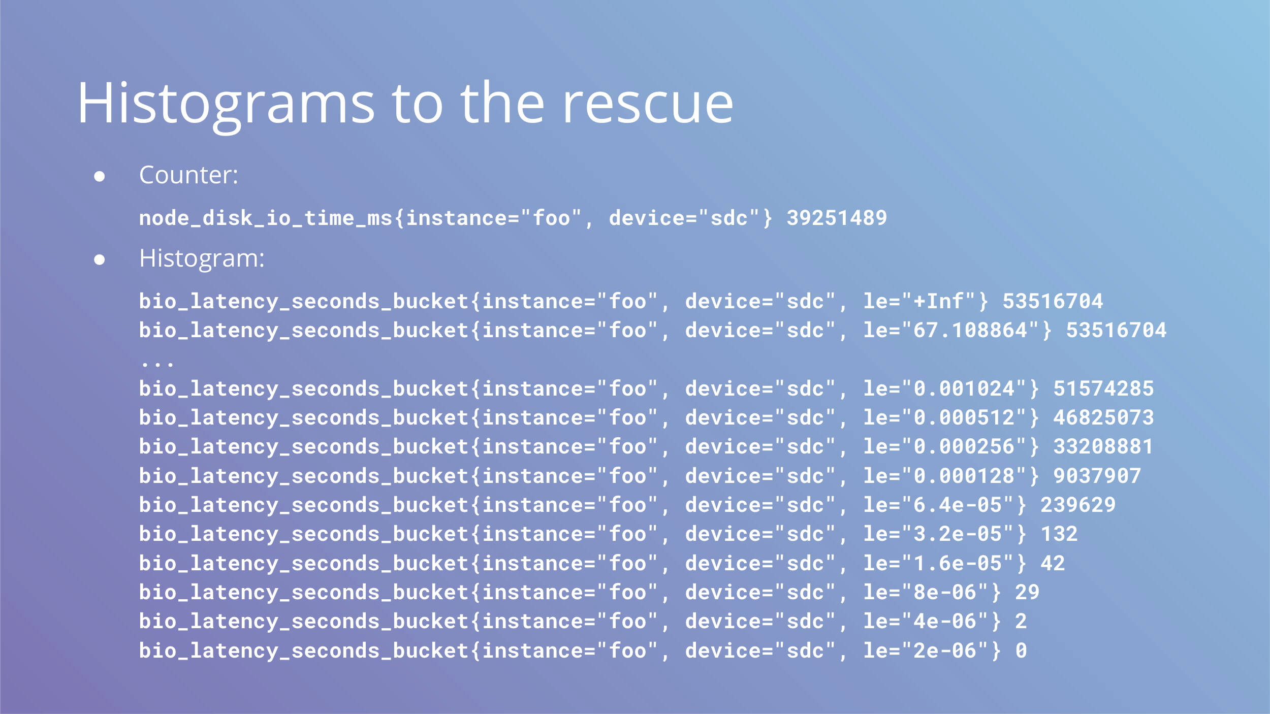
These questions beg for a histogram. What we have is a counter above, but what we want is a histogram below.
Keep in mind that Prometheus histograms are cumulative and le label counts all events lower than or equal to the value of the label.
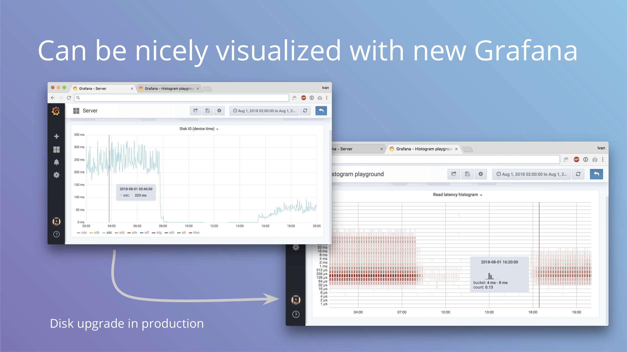
Okay, so imagine we have that histogram. To visualize the difference you get between the two types of metrics here are two screenshots of the same event, which is an SSD replacement in production. We replaced a disk and this is how it affected the line and the histogram. In the new Grafana 5 you can plot histograms as heatmaps and it gives you a lot more detail than just one line.
The next slide has a bigger screenshot, on this slide you should just see the shift in detail.

Here you can see buckets color coded and each timeslot has its own distribution in a tooltip. It can definitely get easier to understand with bar highlights and double Y axis, but it’s a big step forward from just one line nonetheless.
In addition to nice visualizations, you can also plot number of events above Xms and have alerts and SLOs on that. For example, you can alert if your read latency for block devices exceeds 10ms.
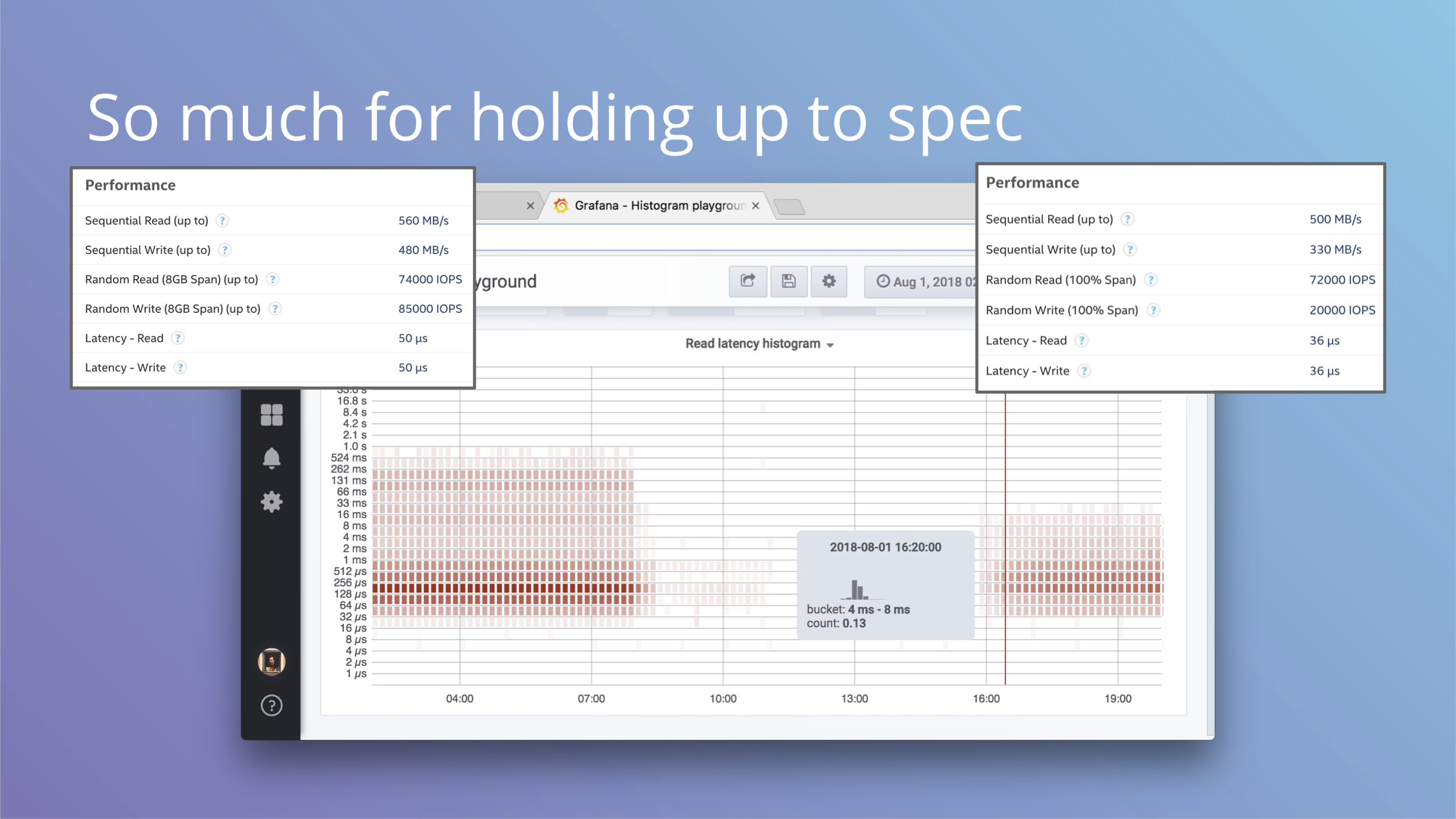
And if you were looking closely at these histograms, you may have noticed values on the Y axis are kind of high. Before the replacement you can see values in 0.5s to 1.0s bucket.
Tech specs for the left disk give you 50 microsecond read/write latency and on the right you get a slight decrease to 36 microseconds. That’s not what we see on the histogram at all. Sometimes you can spot this with fio in testing, but production workloads may have patterns that are difficult to replicate and have very different characteristics. Histograms show how it is.
Even a few slow requests can hurt overall numbers if you're not careful with IO. We've blogged how this affected our cache latency and how we worked around this recently.
By now you should be convinced that histograms are clearly superior for events where you care about timings of individual events.
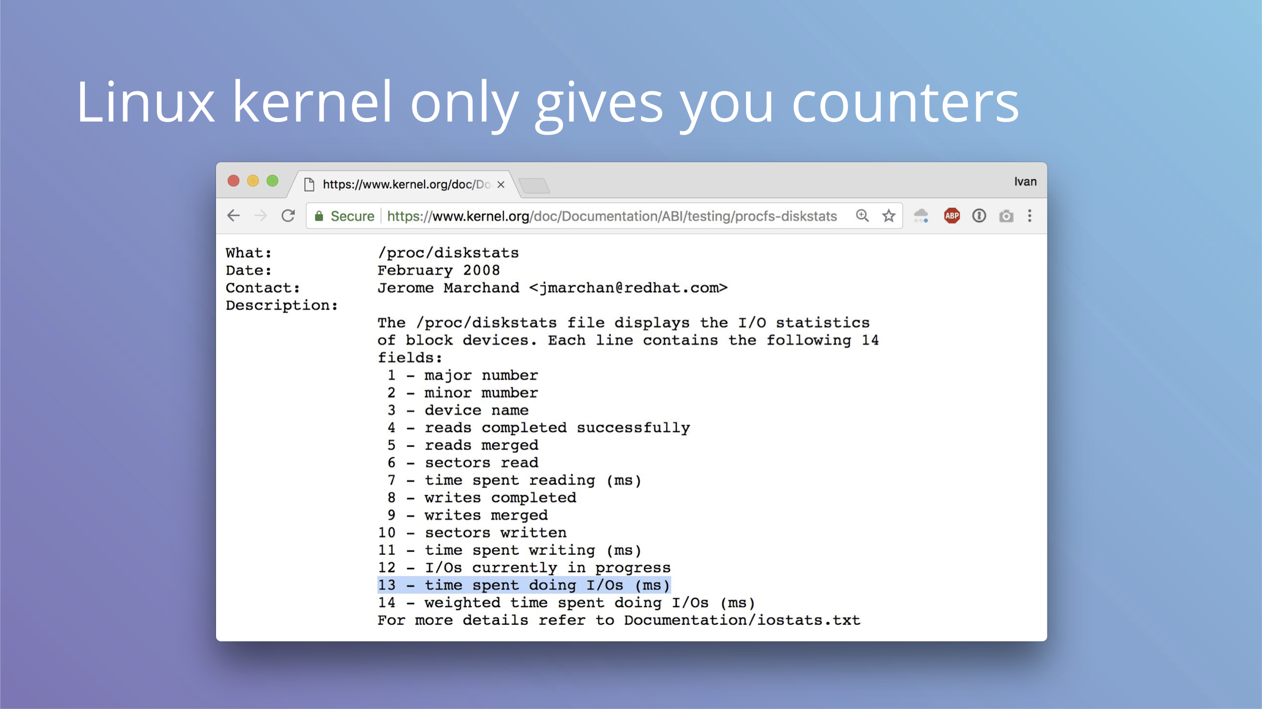
And if you wanted to switch all your storage latency measurements to histograms, I have tough news for you: Linux kernel only provides counters for node_exporter.
You can try to mess with blktrace for this, but it doesn’t seem practical or efficient.
Let’s switch gears a little and see how summary stats from counters can be deceiving.

This is a research from Autodesk. The creature on the left is called Datasaurus. Then there are target figures in the middle and animations on the right.
The amazing part is that shapes on the right and all intermediate animation frames for them have the same values for mean and standard deviation for both X and Y axis.
From summary statistic’s point of view every box on the right is same, but if you plot individual events, a very different picture emerges.
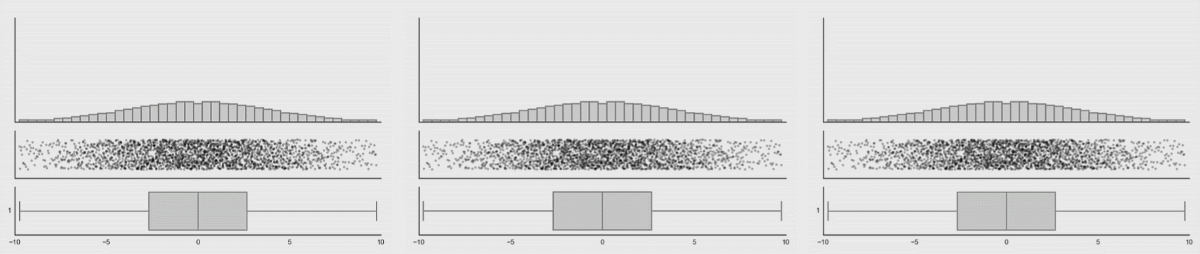
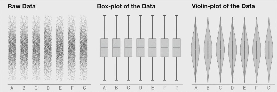
These animations are from the same research, here you can clearly see how box plots (mean + stddev) are non-representative of the raw events.
Histograms, on the contrary, give an accurate picture.
We established that histograms are what you want, but you need individual events to make those histograms. What are the requirements for a system that would handle this task, assuming that we want to measure things like io operations in the Linux kernel?
- It has to be low overhead, otherwise we can’t run it in production
- It has to be universal, so we are not locked into just io tracing
- It has to be supported out of the box, third party kernel modules and patches are not very practical
- And finally it has to be safe, we don’t want to crash large chunk of the internet we're responsible for to get some metrics, even if they are interesting
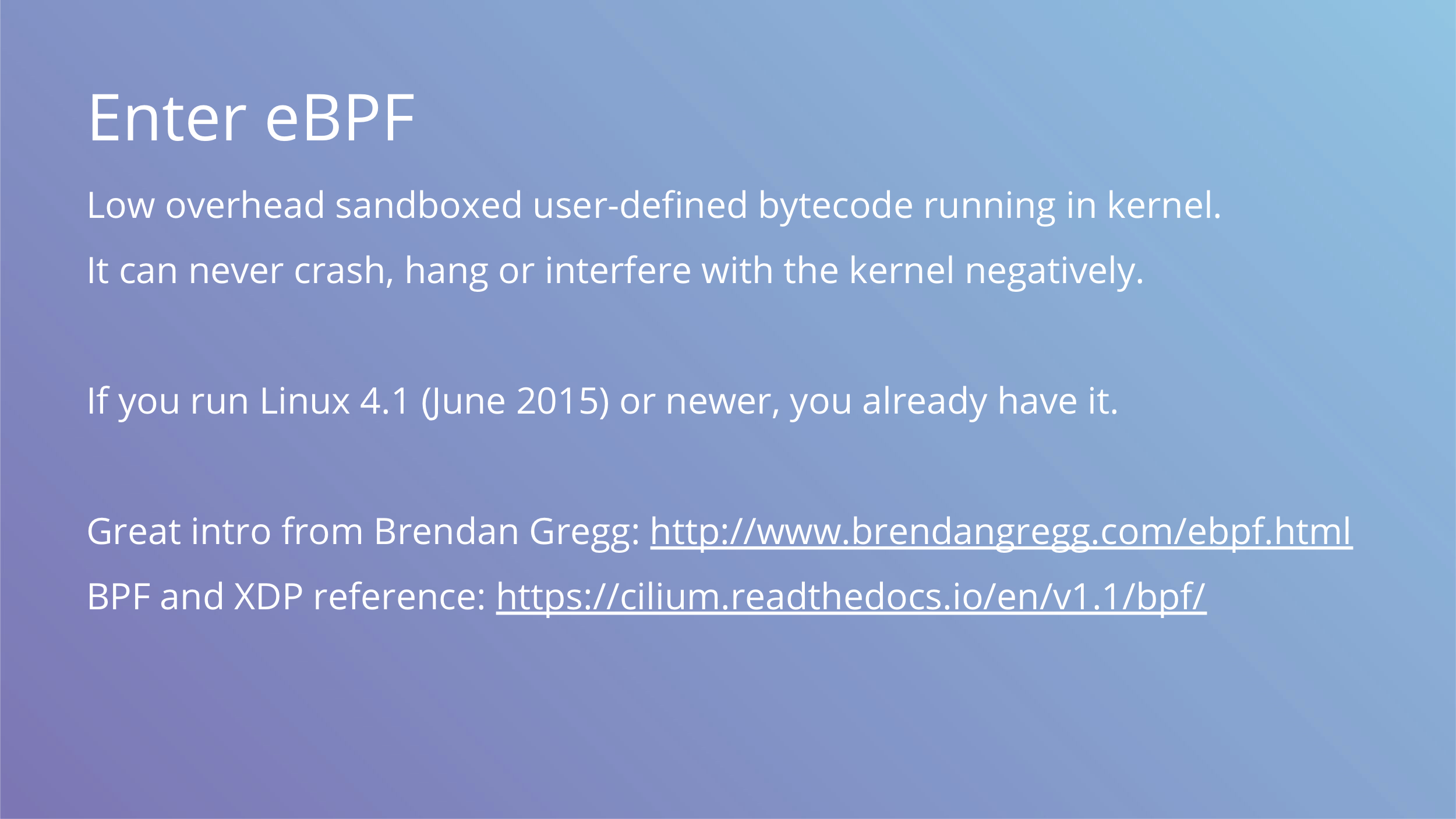
And it turns out, there’s a solution called eBPF. It’s a low overhead sandboxed user-defined bytecode running in the kernel. It can never crash, hang or interfere with the kernel negatively. That sounds kind of vague, but here are two links that dive into the details explaining how this works.
The main part is that it’s already included with the Linux kernel. It’s used in networking subsystem and things like seccomp rules, but as a general “run safe code in the kernel” it has many uses beyond that.
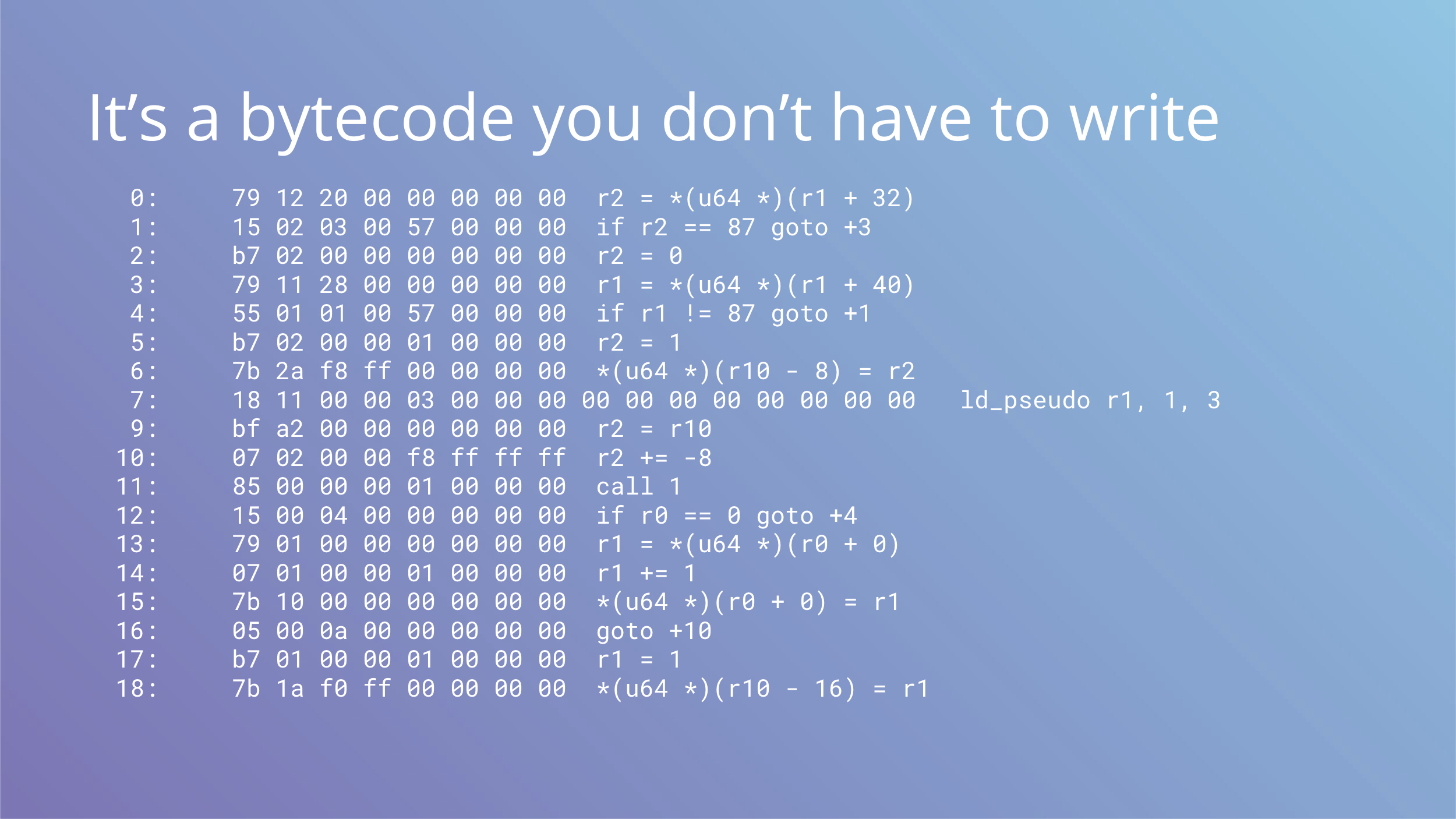
We said it’s a bytecode and this is how it looks. The good part is that you never have to write this by hand.
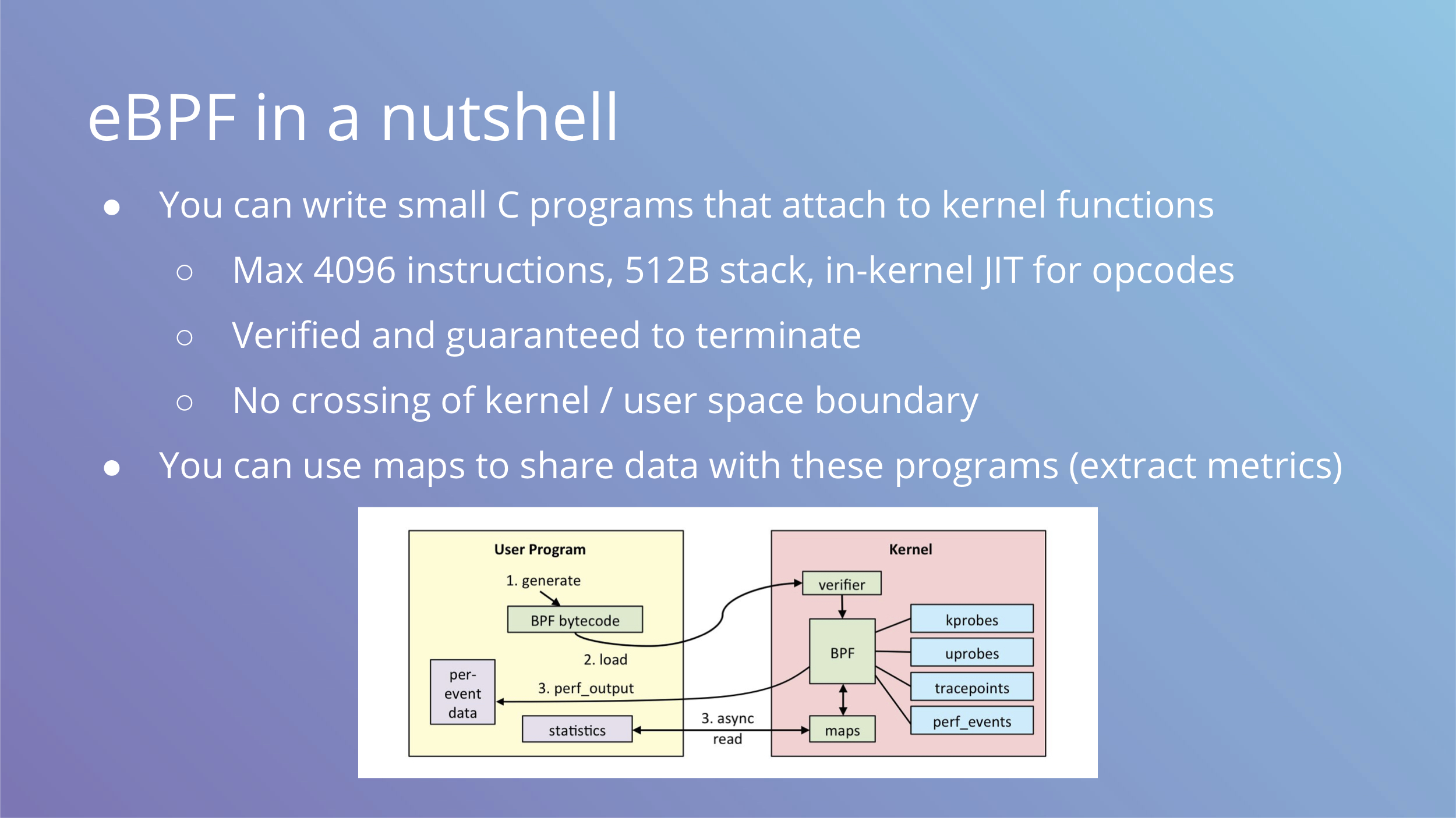
To use eBPF you write small C programs that attach to kernel functions and run before or after them. Your C code is then compiled into bytecode, verified and loaded into kernel to run with JIT compiler for translation into native opcodes. The constraints on the code are enforced by verifier and you are guaranteed to not be able to write an infinite loop or allocate tons of memory.
To share data with eBPF programs, you can use maps. In terms of metric collection, maps are updated by eBPF programs in the kernel and only accessed by userspace during scraping.
It is critical for performance that the eBPF VM runs in the kernel and does not cross userspace boundary.
You can see the workflow on the image above.
Having to write C is not an eBPF constraint, you can produce bytecode in any way you want. There are other alternatives like lua and ply, and sysdig is adding a backed to run via eBPF too. Maybe someday people will be writing safe javacript that runs in the kernel.
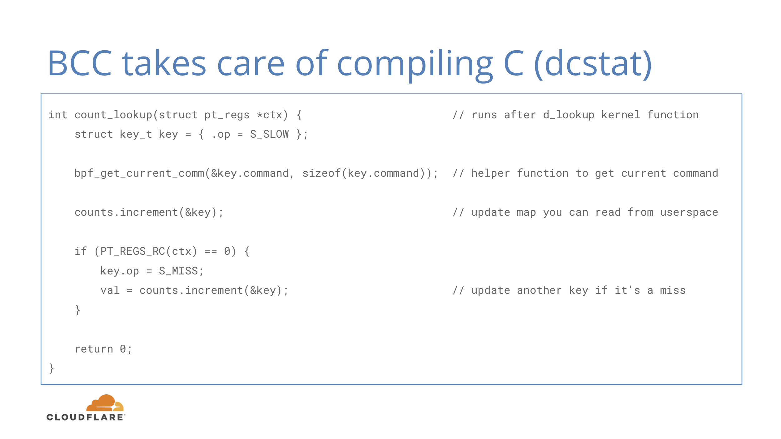
Just like GCC compiles C code into machine code, BCC compiles C code into eBPF opcodes. BCC is a rewriter plus LLVM compiler and you can use it as a library in your code. There are bindings for C, C++, Python and Go.
In this example we have a simple function that runs after d_lookup kernel function that is responsible for directory cache lookups. It doesn’t look complicated and the basics should be understandable for people familiar with C-like languages.
In addition to a compiler, BCC includes some tools that can be used for debugging production systems with low overhead eBPF provides.
Let’s quickly go over a few of them.
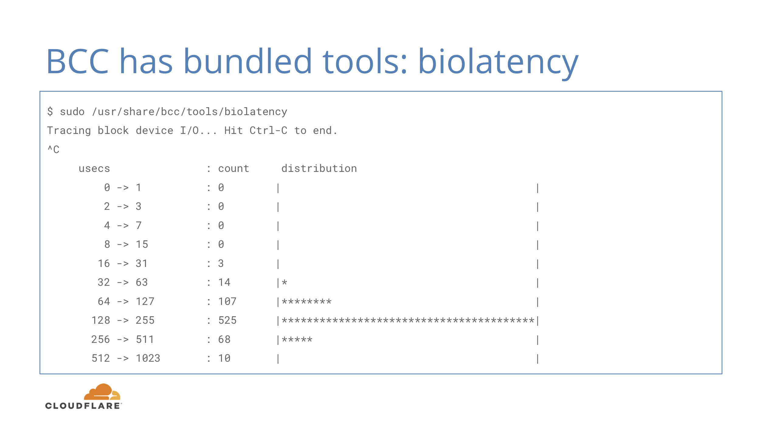
The one above is biolatency, which shows you a histogram of disk io operations. That’s exactly what we started with and it’s already available, just as a script instead of an exporter for Prometheus.
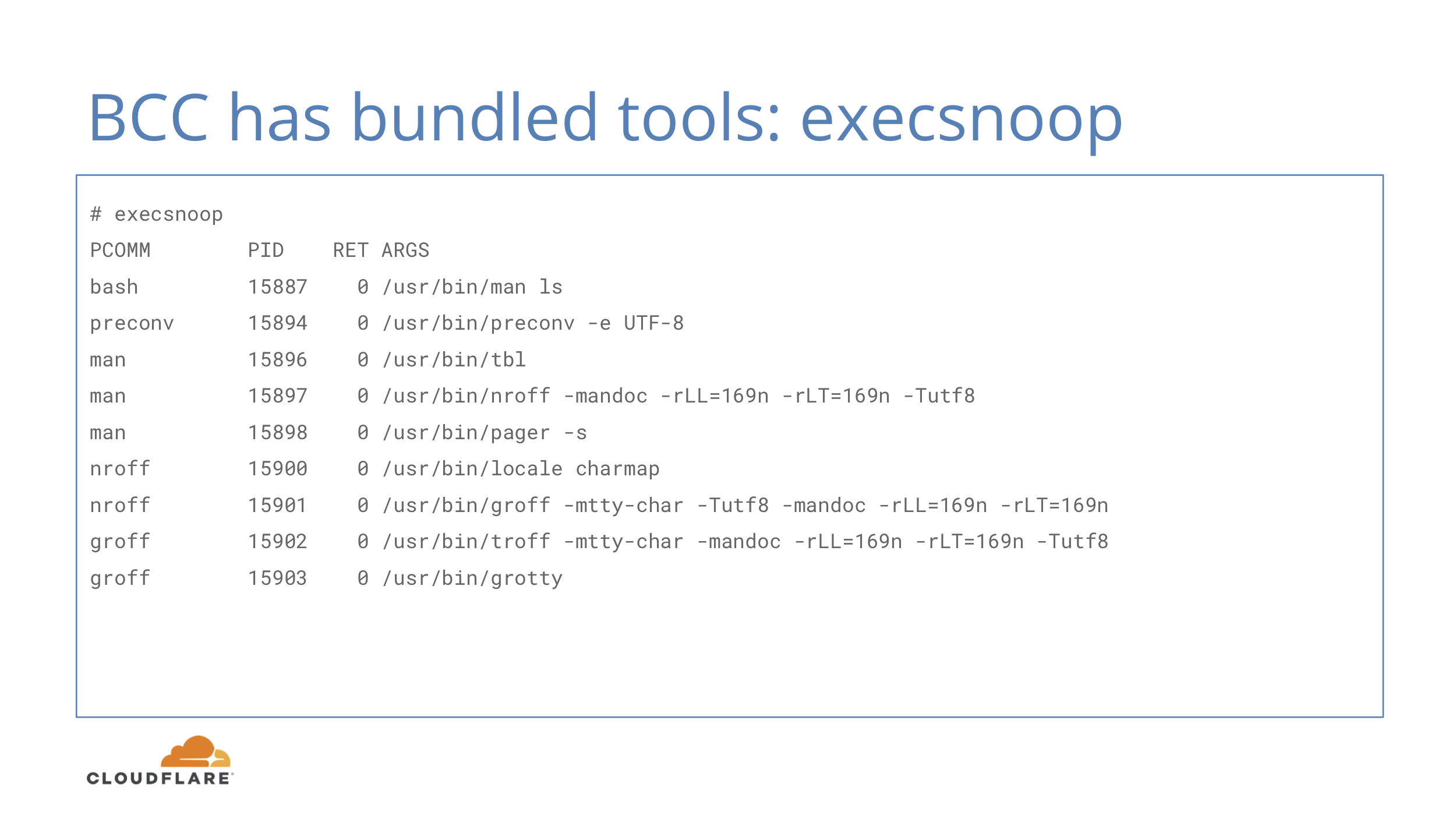
Here’s execsnoop, that allows you to see which commands are being launched in the system. This is often useful if you want to catch quickly terminating programs that do not hang around long enough to be observed in ps output.
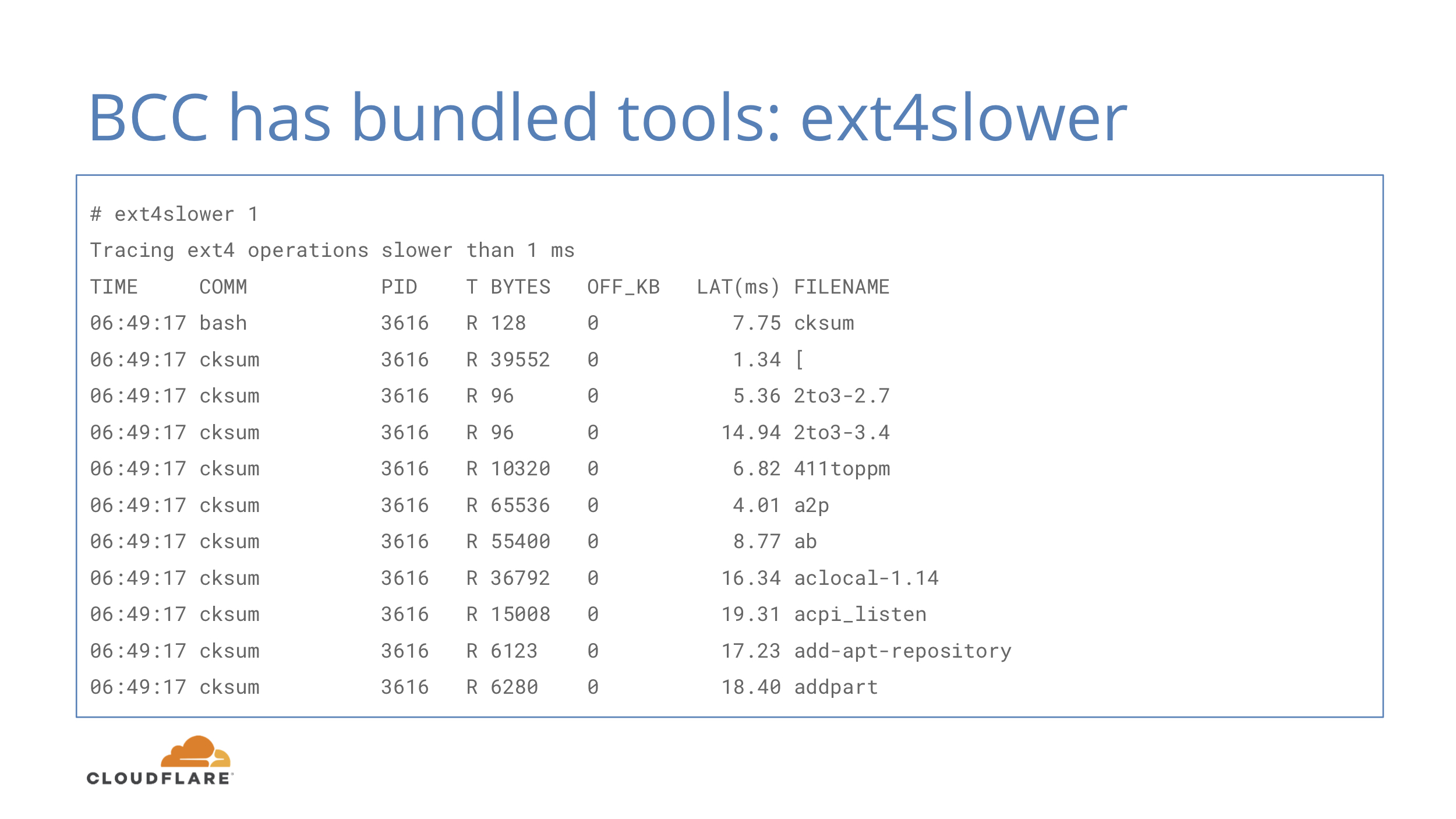
There’s also ext4slower that instead of showing slow IO operations, shows slow ext4 filesystem operations. One might think these two map fairly closely, but one filesystem operation does not necessarily map to one disk IO operation:
- Writes can go into writeback cache and not touch the disk until later
- Reads can involve multiple IOs to the physical device
- Reads can also be blocked behind async writes
The more you know about disk io, the more you want to run stateless, really. Sadly, RAM prices are not going down.
Okay, now to the main idea of this post. We have all these primitives, now we should be able to tie them all together and get an ebpf_exporter on our hands to get metrics in Prometheus where they belong. Many BCC tools already have kernel side ready, reviewed and battle tested, so the hardest part is covered.
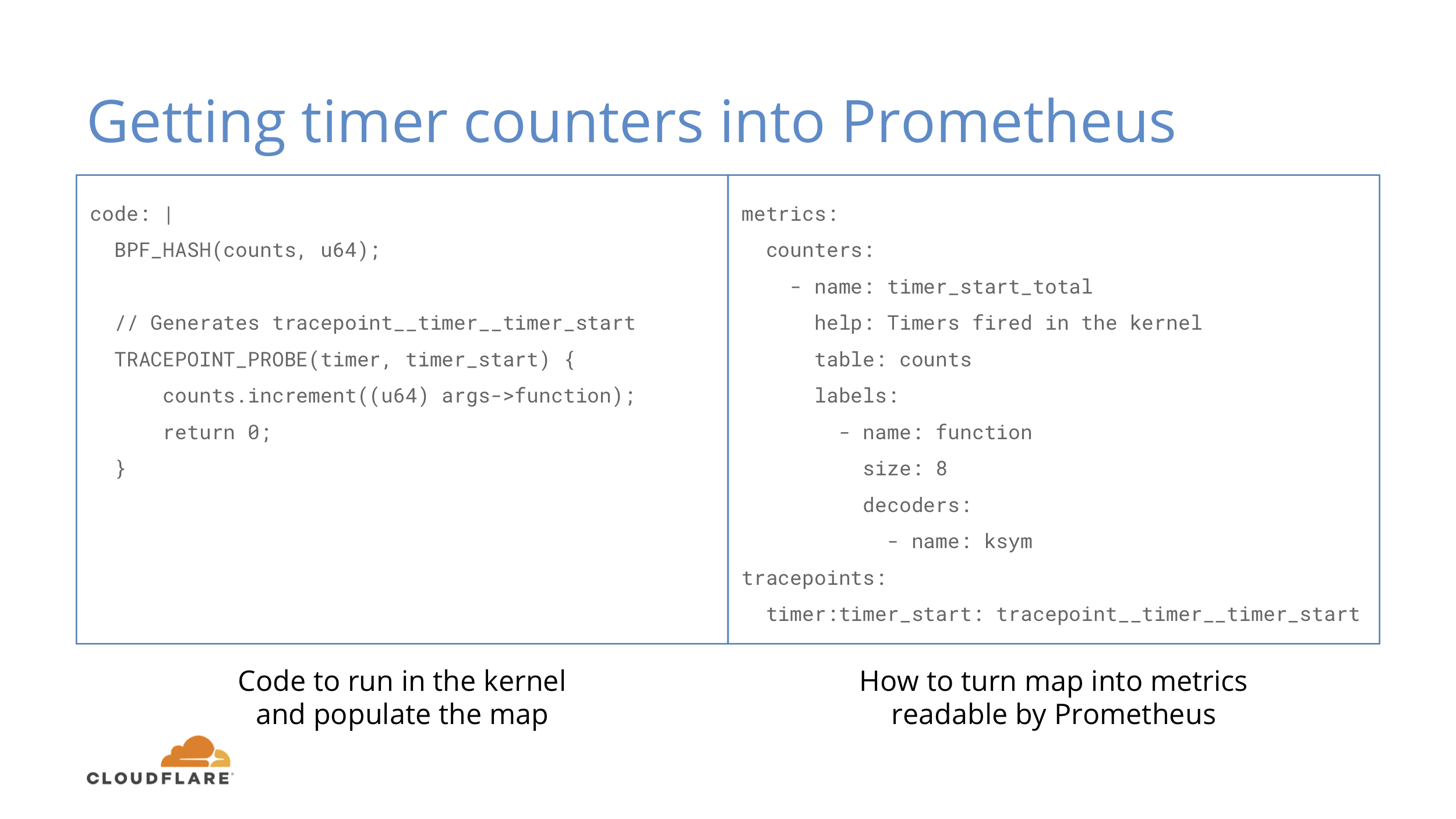
Let’s look at a simple example to get counters for timers fired in the kernel. This example is from the ebpf_exporter repo, where you can find a few more complex ones.
On the BCC code side we define a hash and attach to a tracepoint. When the tracepoint fires, we increment our hash where the key is the address of a function that fired the tracepoint.
On the exporter side we say that we want to take the hash and transform 8 byte keys with ksym decoder. Kernel keeps a map of function addresses to their names in /proc/kallsyms and we just use that. We also define that we want to attach our function to timer:timer_start tracepoint.
This is objectively quite verbose and perhaps some things can be inferred instead of being explicit.
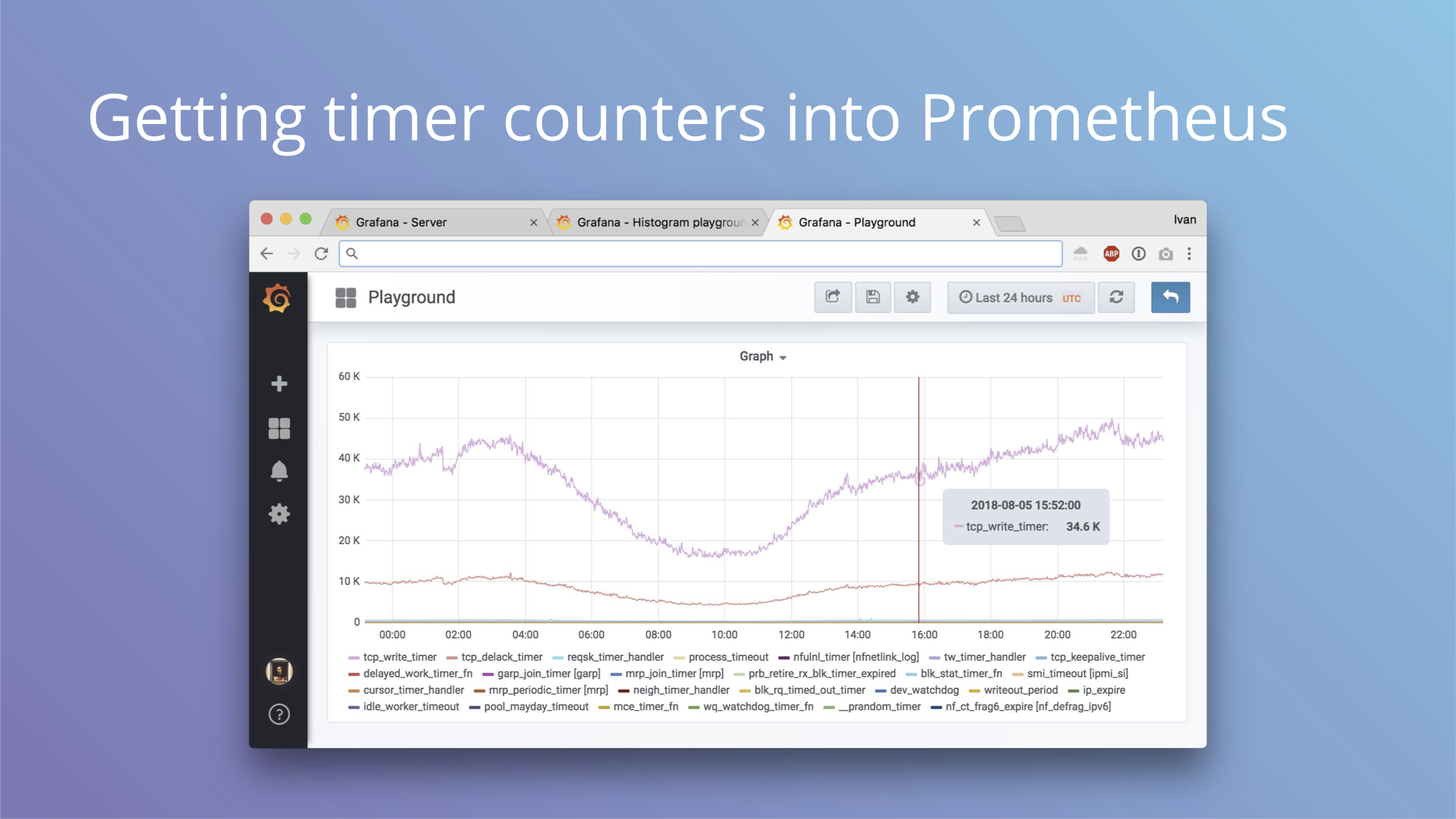
This is an example graph we can get out of this exporter config.
Why can this be useful? You may remember our blog post about our tracing of a weird bug during OS upgrade from Debian Jessie to Stretch.
TL;DR is that systemd bug broke TCP segmentation offload on vlan interface, which increased CPU load 5x and introduced lots of interesting side effects up to memory allocation stalls. You do not want to see that allocating one page takes 12 seconds, but that's exactly what we were seeing.
If we had timer metrics enabled, we would have seen the clear change in metrics sooner.
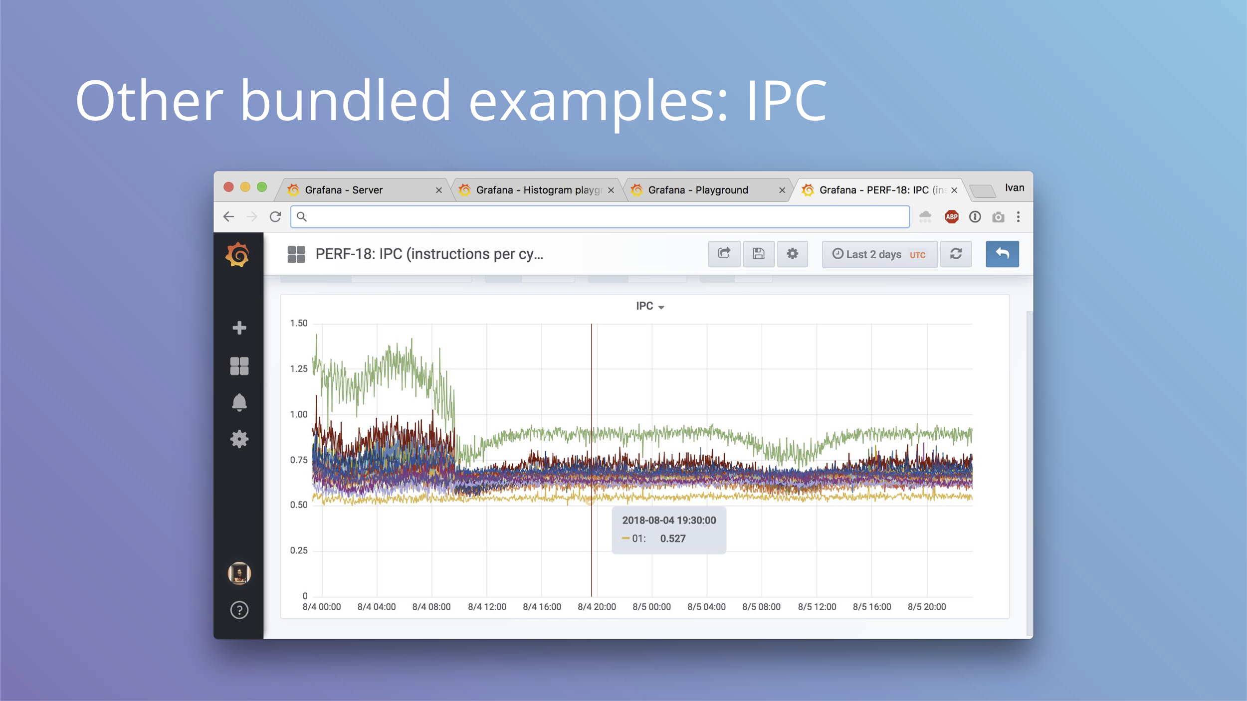
Another bundled example can give you IPC or instruction per cycle metrics for each CPU. On this production system we can see a few interesting things:
- Not all cores are equal, with two cores being outliers (green on the top is zero, yellow on the bottom is one)
- Something happened that dropped IPC of what looks like half of cores
- There’s some variation in daily load cycles that affects IPC
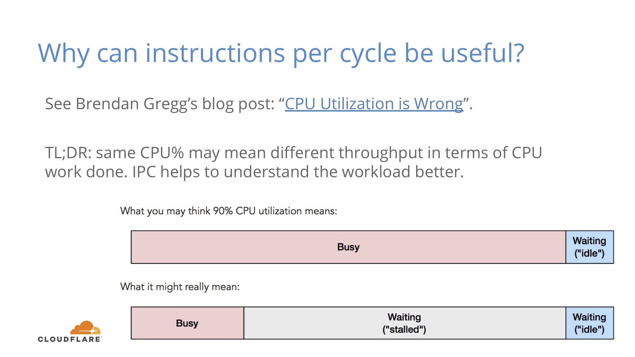
Why can this be useful? Check out Brendan Gregg’s somewhat controversial blog post about CPU utilization.
TL;DR is that CPU% does not include memory stalls that do not perform any useful compute work. IPC helps to understand that factor better.
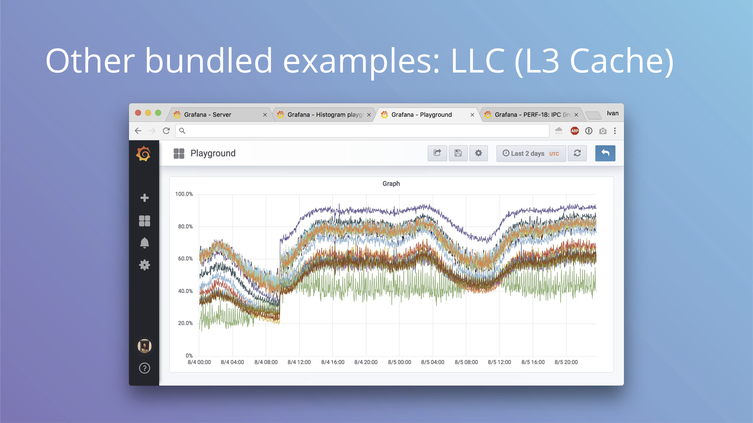
Another bundled example is LLC or L3 CPU cache hit rate. This is from the same machine as IPC metrics and you can see some major affecting not just IPC, but also the hit rate.
Why can this be useful? You can see how your CPU cache is doing and you can see how it may be affected by bigger L3 cache or more cores sharing the same cache.
LLC hit rate usually goes hand in hand with IPC patterns as well.
Now to the fun part. We started with IO latency histograms and they are bundled with ebpf_exporter examples.
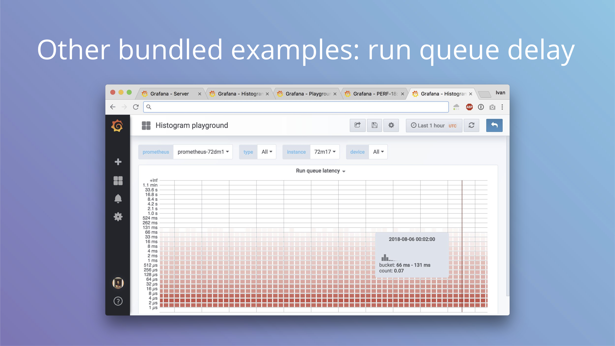
This is also a histogram, but now for run queue latency. When a process is woken up in the kernel, it’s ready to run. If CPU is idle, it can run immediately and scheduling delay is zero. If CPU is busy doing some other work, the process is put on a run queue and the CPU picks it up when it’s available. That delay between being ready to run and actually running is the scheduling delay and it affects latency for interactive applications.
In cAdvisor you have a counter with this delay, here you have a histogram of actual values of that delay.
Understanding of how you can be delayed is important for understanding the causes of externally visible latency. Check out another blog post by Brendan Gregg to see how you can further trace and understand scheduling delays with Linux perf tool. It's quite surprising how high delay can be on even an even lighty loaded machine.
It also helps to have a metrics that you can observe if you change any scheduling sysctls in the kernel. The law is that you can never trust internet or even your own judgement to change any sysctls. If you can’t measure the effects, you are lying to yourself.
There’s also another great post from Scylla people about their finds. We were able to apply their sysctls and observe results, which was quite satisfying.
Things like pinning processes to CPUs also affects scheduling, so this metric is invaluable for such experiments.
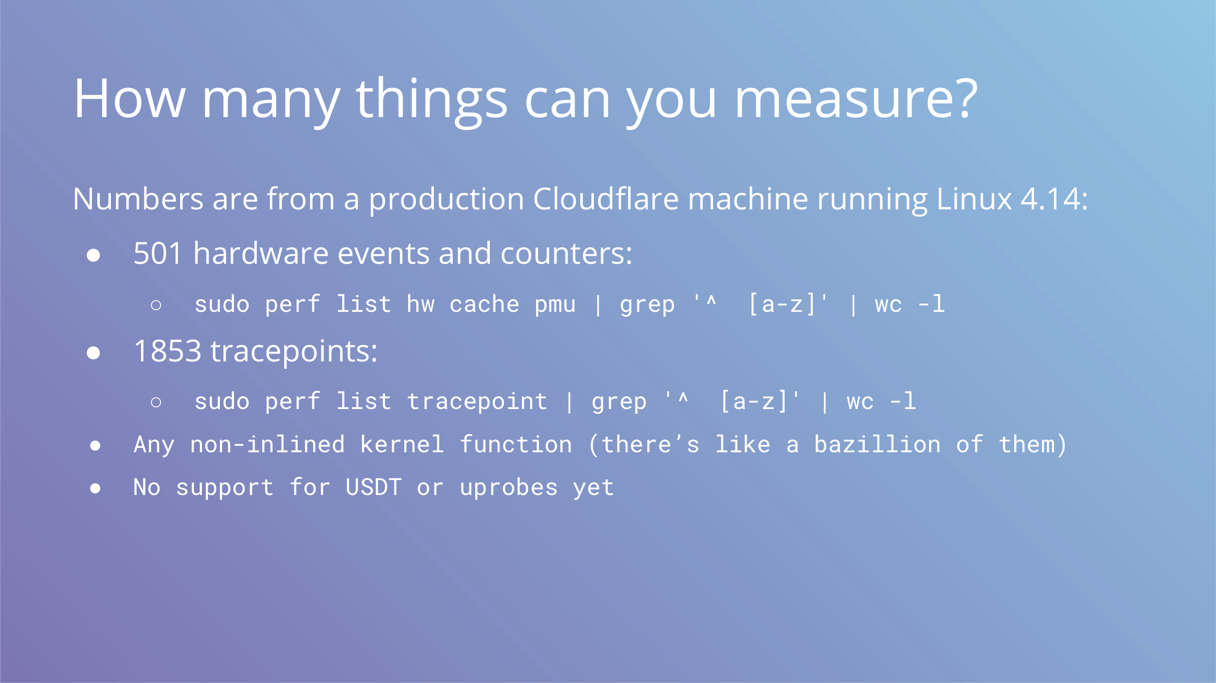
The examples we gave are not the only ones possible. In addition to IPC and LLC metrics there are around 500 hardware metrics you can get on a typical server.
There are around 2000 tracepoints with stable ABI you can use on many kernel subsystems.
And you can always trace any non-inlined kernel function with kprobes and kretprobes, but nobody guarantees binary compatibility between releases for those. Some are stable, others not so much.
We don’t have support for user statically defined tracepoints or uprobes, which means you cannot trace userspace applications. This is something we can reconsider in the future, but in the meantime you can always add metrics to your apps by regular means.
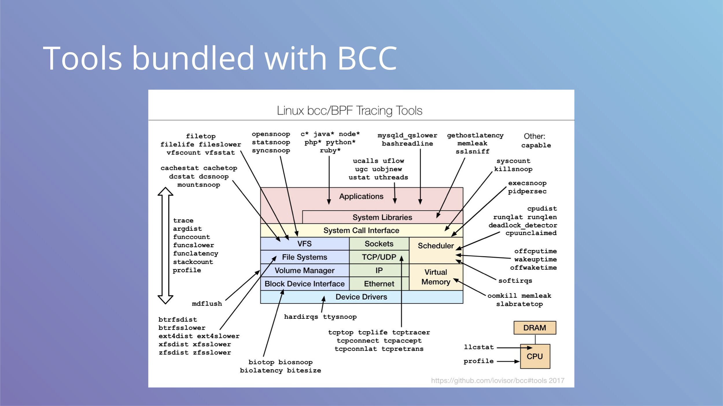
This image shows tools that BCC provides, you can see it covers many aspects.
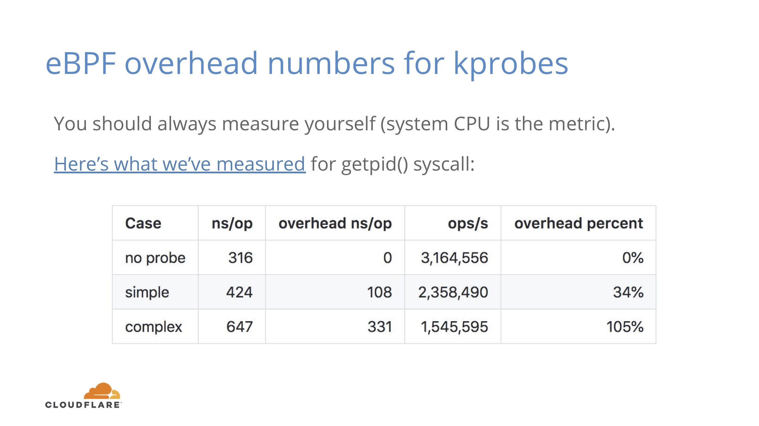
Nothing in this life is free and even low overhead still means some overhead. You should measure this in your own environment, but this is what we’ve seen.
For a fast getpid() syscall you get around 34% overhead if you count them by PID. 34% sounds like a lot, but it’s the simplest syscall and 100ns overhead is a cost of one memory reference.
For a complex case where we mix command name to copy some memory and mix in some randomness, the number jumps to 330ns or 105% overhead. We can still do 1.55M ops/s instead of 3.16M ops/s per logical core. If you measure something that doesn’t happen as often on each core, you’re probably not going to notice it as much.
We've seen run queue latency histogram to add 300ms of system time on a machine with 40 logical cores and 250K scheduling events per second.
Your mileage may vary.
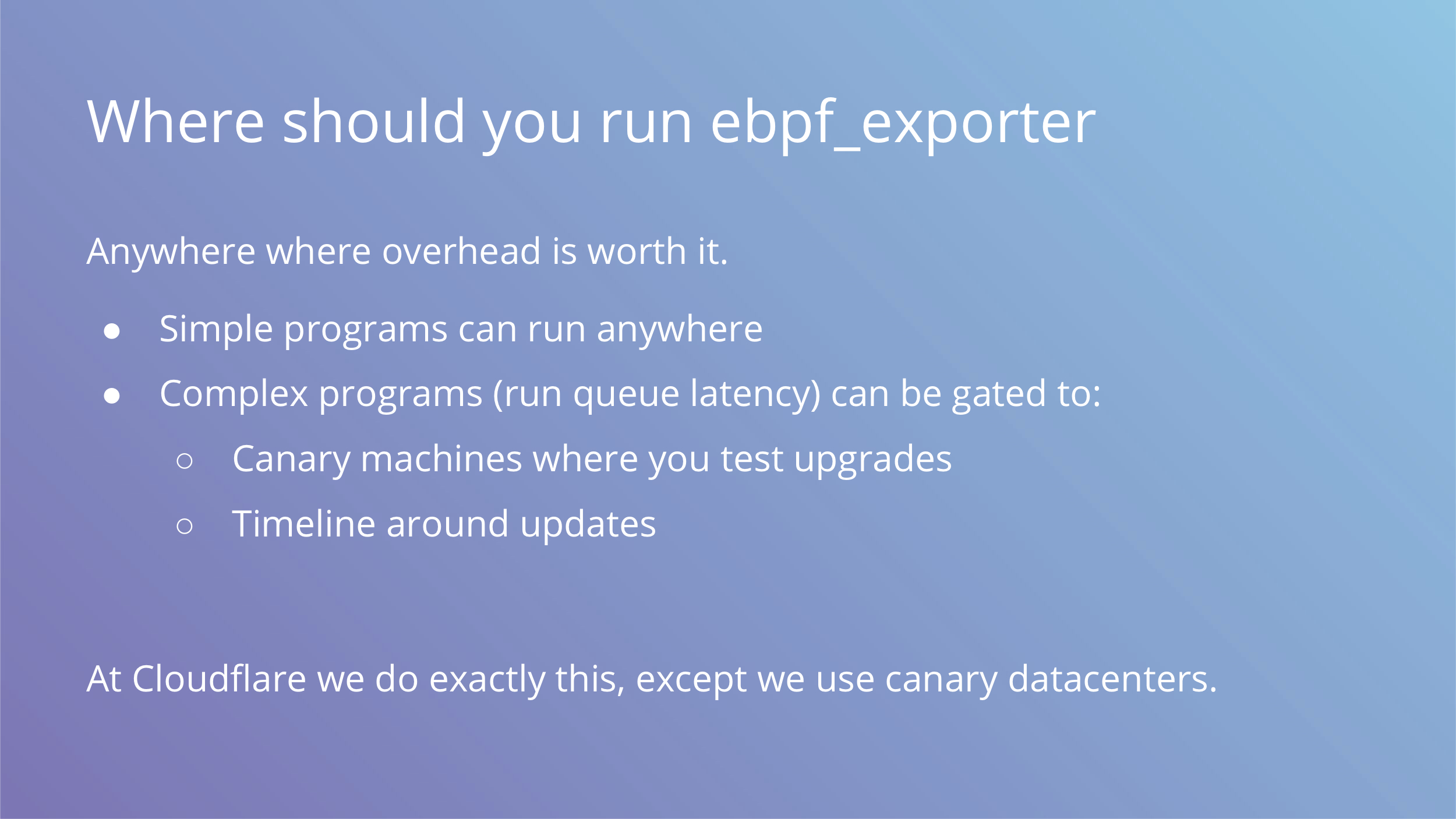
So where should you run the exporter then? The answer is anywhere you feel comfortable.
If you run simple programs, it doesn’t hurt to run anywhere. If you are concerned about overhead, you can do it only on canary instances and hope for results to be representative. We do exactly that, but instead of canary instances we have a luxury of having a couple of canary datacenters with live customers. They get updates after our offices do, so it’s not as bad as it sounds.
For some upgrade events you may want to enable more extensive metrics. An example would be a major distro or kernel upgrade.
The last thing we wanted to mention is that ebpf_exporter is open source and we encourage you to try it and maybe contribute interesting examples that may be useful to others.
GitHub: https://github.com/cloudflare/ebpf_exporter
Reading materials on eBPF:
- https://iovisor.github.io/bcc/
- https://github.com/iovisor/bcc/blob/master/docs/reference_guide.md
- http://www.brendangregg.com/ebpf.html
- http://docs.cilium.io/en/latest/bpf/
While this post was in drafts, we added another example for tracing port exhaustion issues and that took under 10 minutes to write.